SYNERGY
2024
About the project
AI-Driven Insights:
Redesigning the Business Consulting Analysis System
Synergy is a transformative platform that integrates AI to enhance the analytical capabilities of business consulting students, empowering them to refine their strategies and insights.
My part of the project was to redesign the platform to enhance user experience, conduct user research, and create an intuitive system, ensuring smooth and easy use.
Tools I used
Problem
Clarity Lost: Confusion
& Feedback Failures
Uncovering Platform Challenges
This approach allowed me to pinpoint specific pain points and areas of confusion, ensuring that the redesign would address their real needs and improve overall usability.
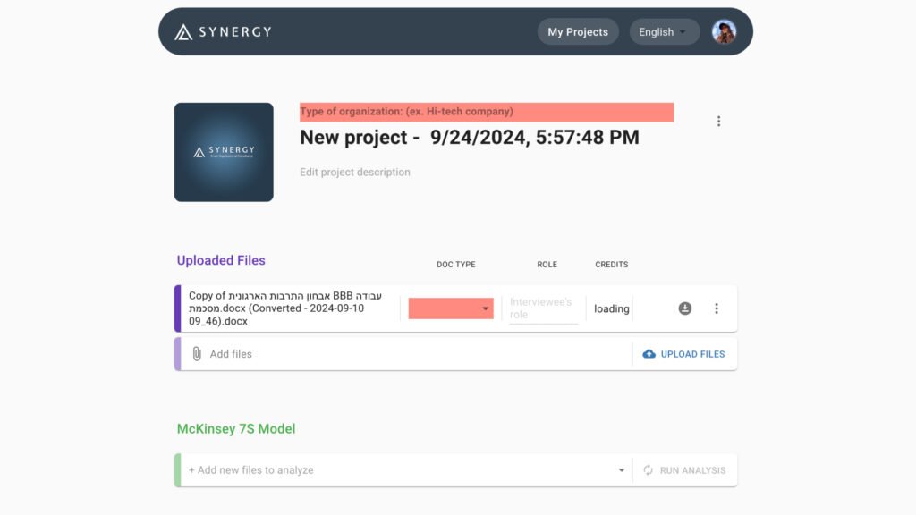
Old Synergy design - new project page
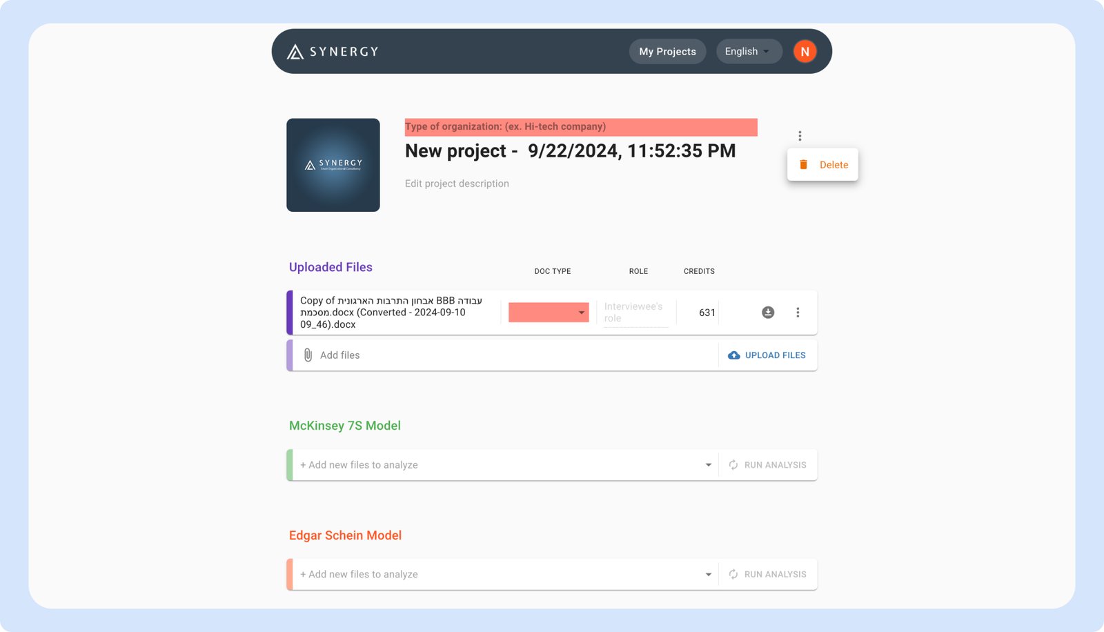
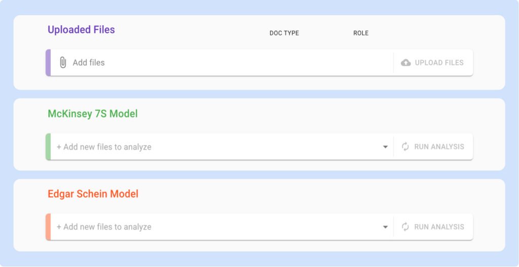
The file upload field and analysis fields appeared similar, leading to confusion about their purposes and hindering effective navigation.
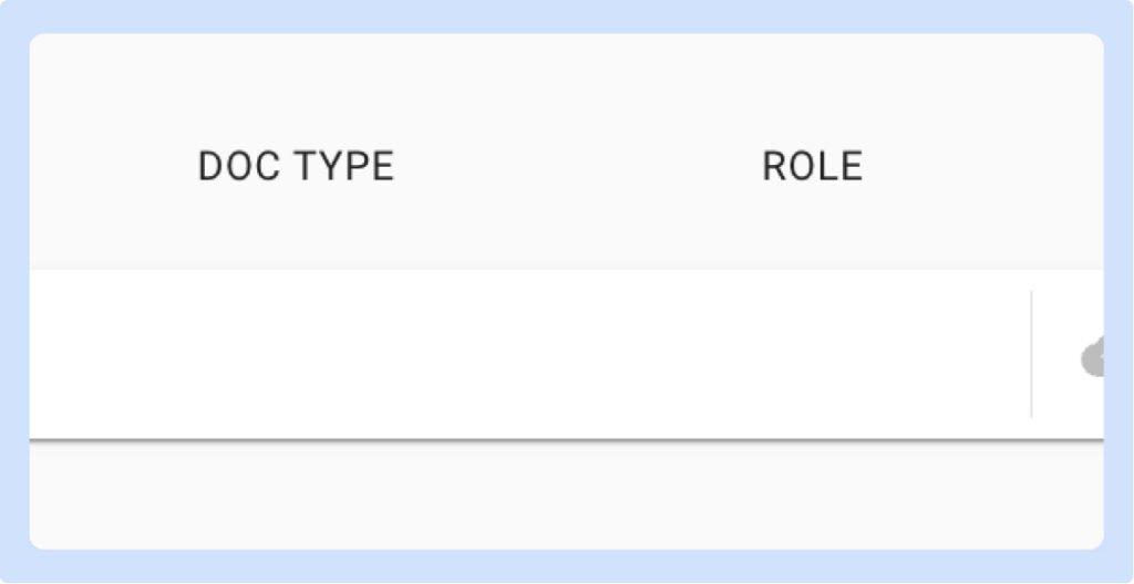
Prior to uploading the file, users were unclear about the labels that had no content, they weren’t sure about it’s purpose.
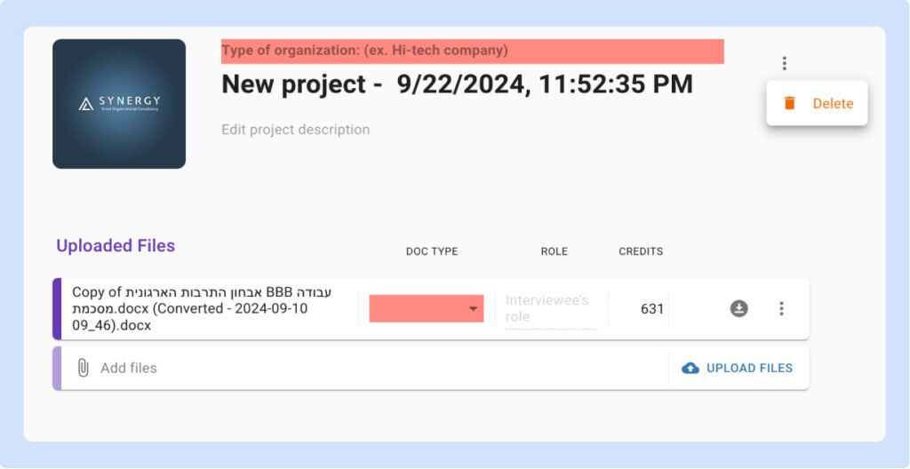
This confusion was exacerbated by the misleading three-dot button intended for editing, which led users to expect editing options that were not present, as edits are made directly on the project details. This inconsistency resulted in user frustration.
Target Audience
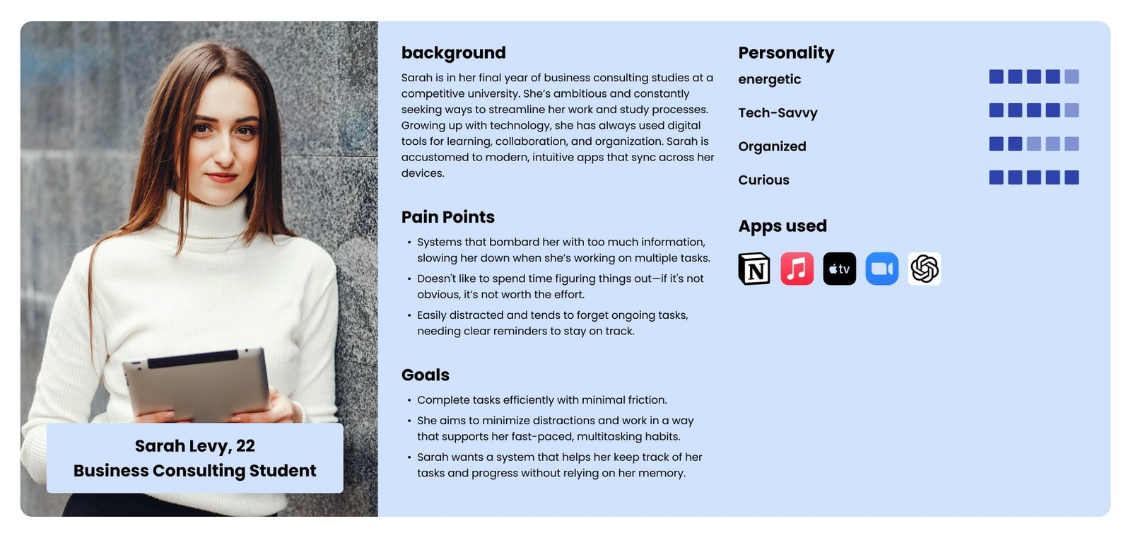
Students (18-30):
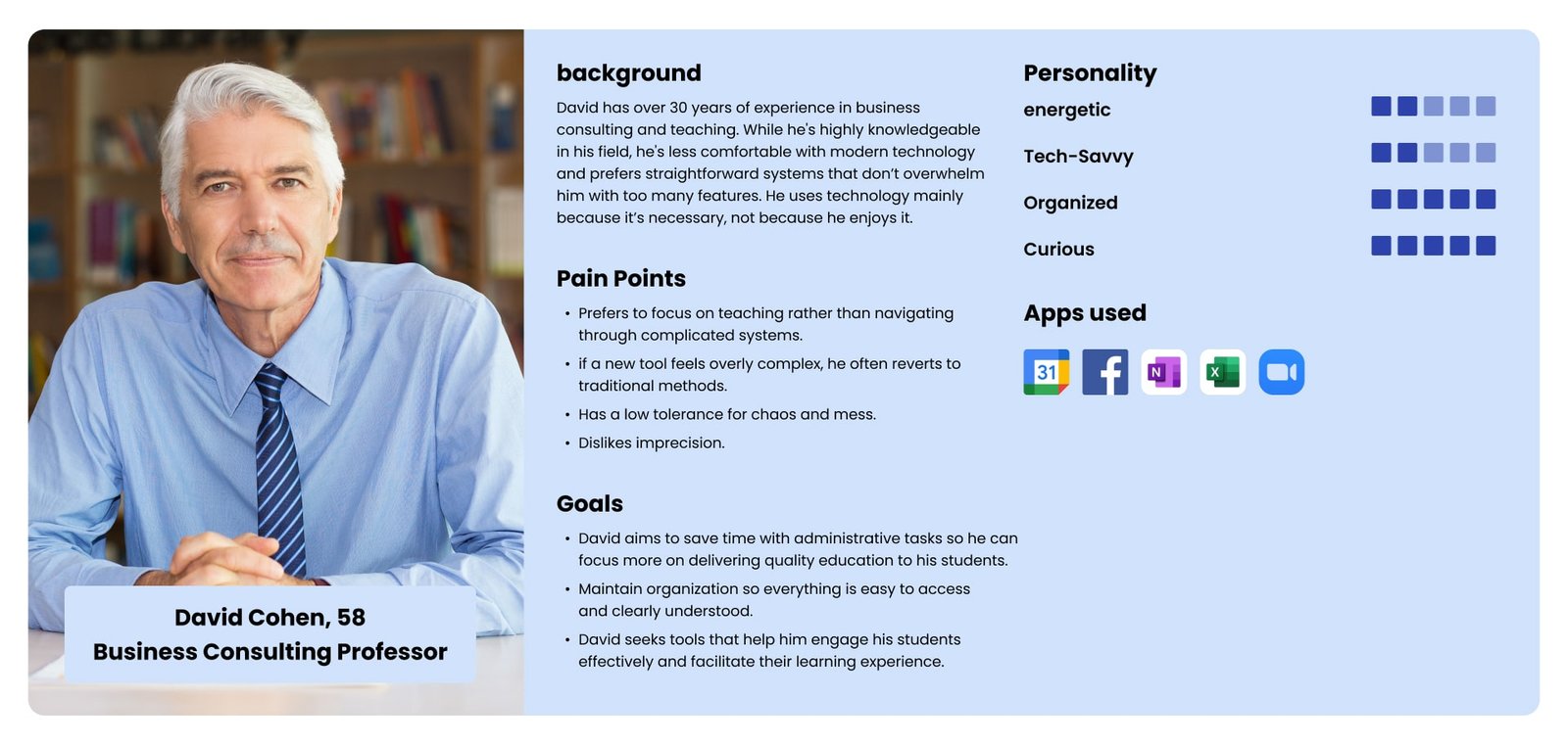
This group is made up of modern, digital-native individuals. They are quick to adapt to new technologies and expect seamless, intuitive interfaces. They value efficiency, speed, and features that help them stay organized, such as real-time updates and reminders. Aesthetically, they lean toward clean, modern designs with a focus on usability.
Teachers (40-65):
Older, more traditional users, these individuals often prefer simplicity over advanced functionality. They are less familiar with fast-evolving technology. Their primary needs are clarity, reliability, and well-organized processes. Minimizing complexity and providing helpful guidance are key to their positive experience.
Wire frames
First steps to a visual product
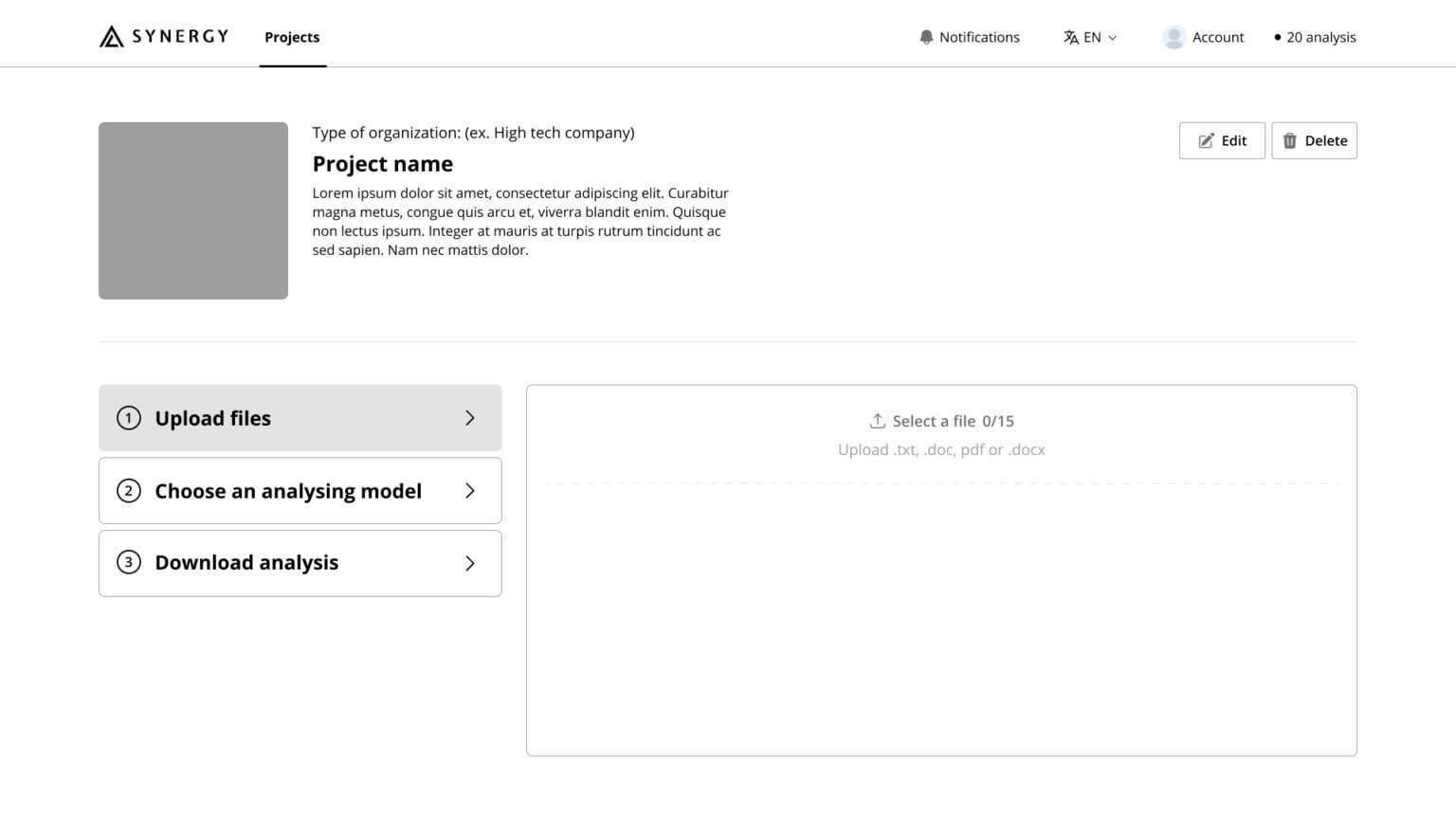
My priority was to simplify the user actions, ensuring a clean and intuitive interface where everything is as clear as possible.
User flow
Simplifying the Project Creation Flow
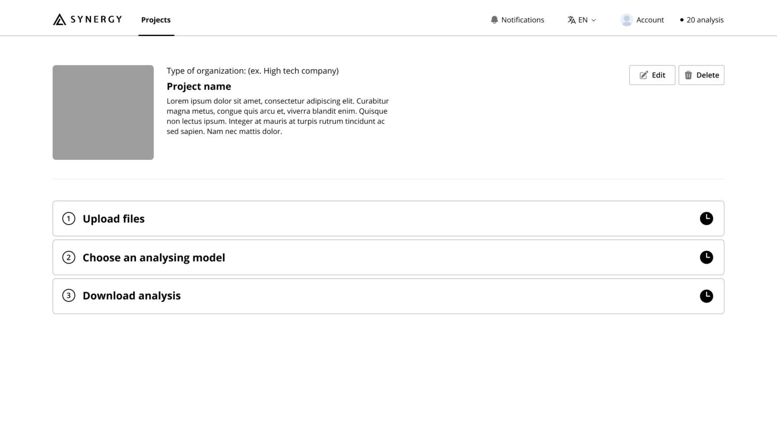
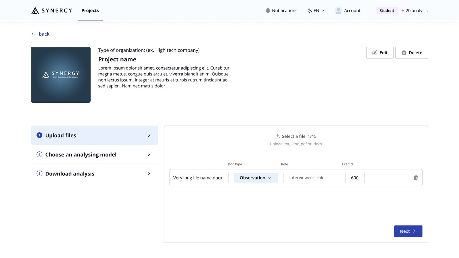
My goal was to overhaul this flow by providing clear steps, and designing an intuitive layout that made project creation straightforward and frustration-free.
Solution
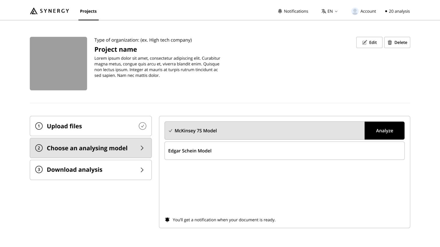
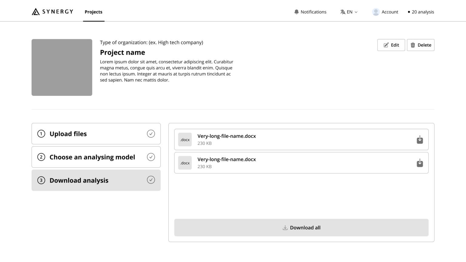
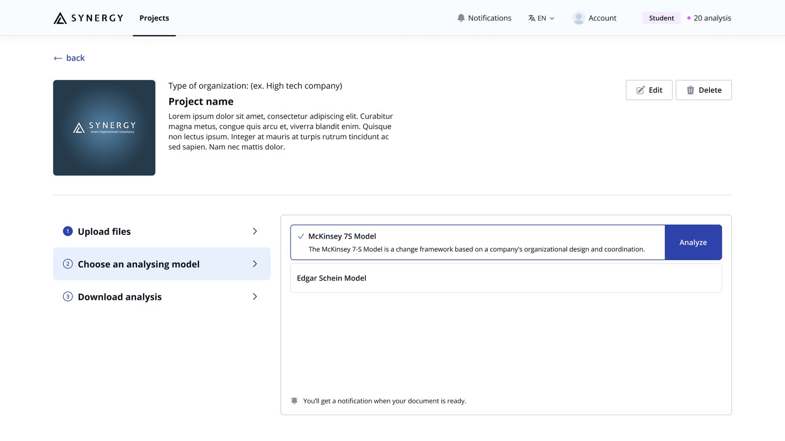
Seamless Minimalist Experience
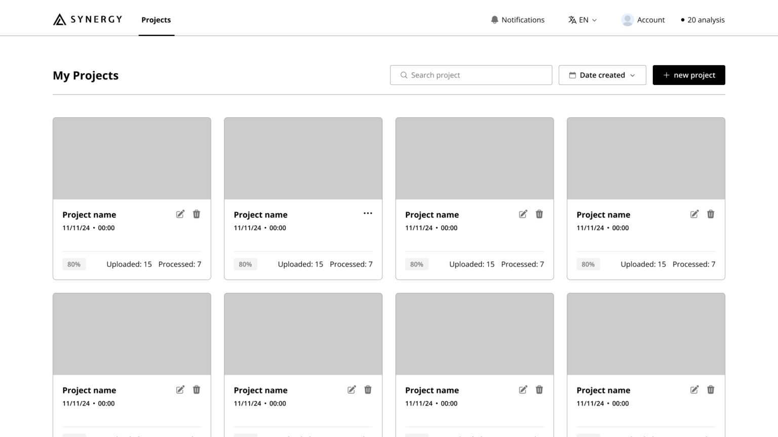
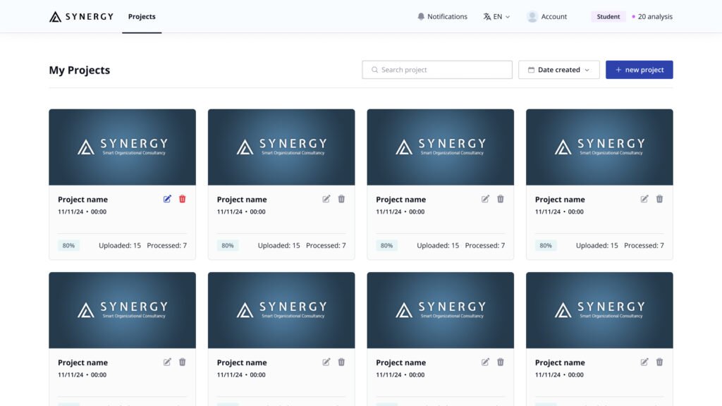
The solution was a clean, thoughtfully designed system with a gentle color palette that is inviting and non-intimidating.
The minimalist design enhances the user experience by creating a sense of order and clarity, guiding users seamlessly through the process.
By reducing visual clutter and using a soft, harmonious color scheme, the interface helps users feel more comfortable and focused, ensuring that their actions are intuitive and easy to follow. This design is particularly suitable for business consulting schools and students, as it fosters an accessible learning environment that encourages engagement and exploration.
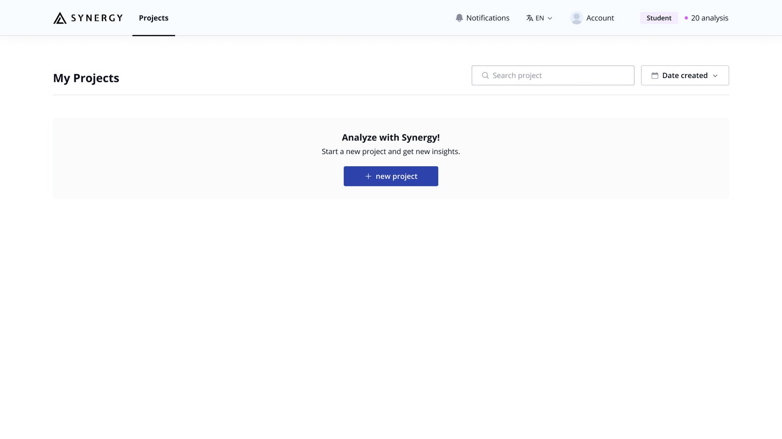
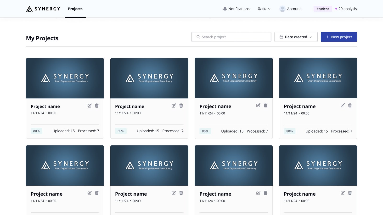
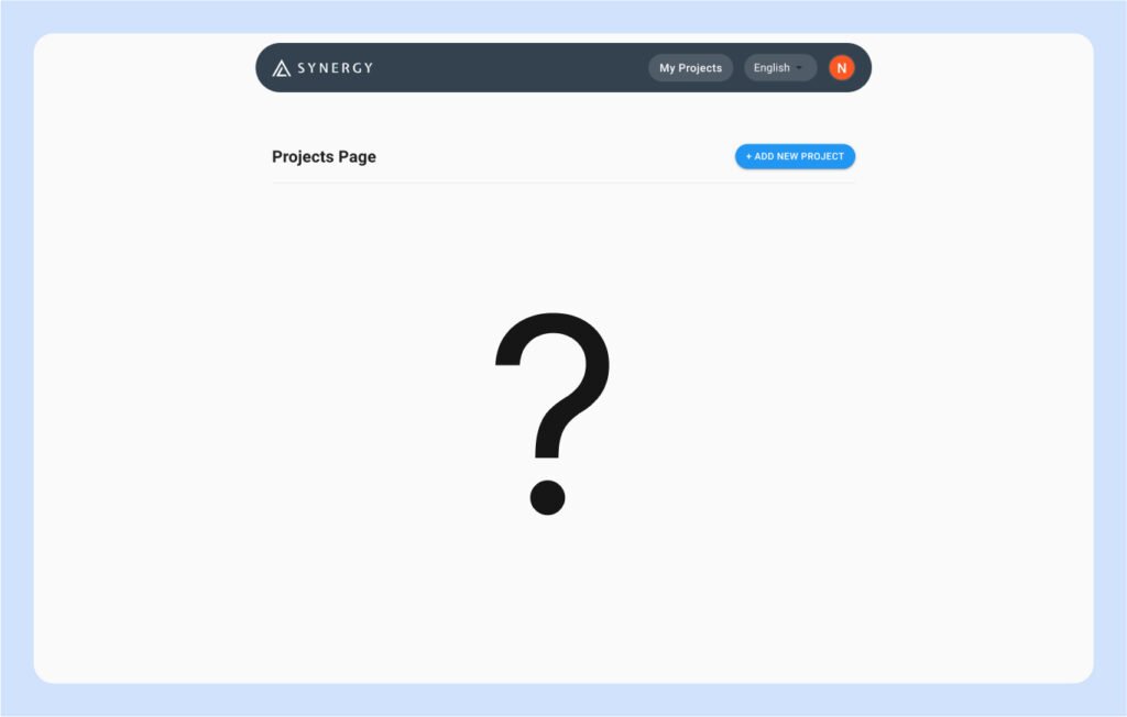
Projects page - Before
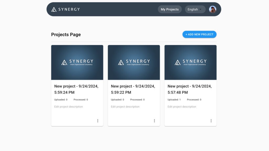
Projects page - After
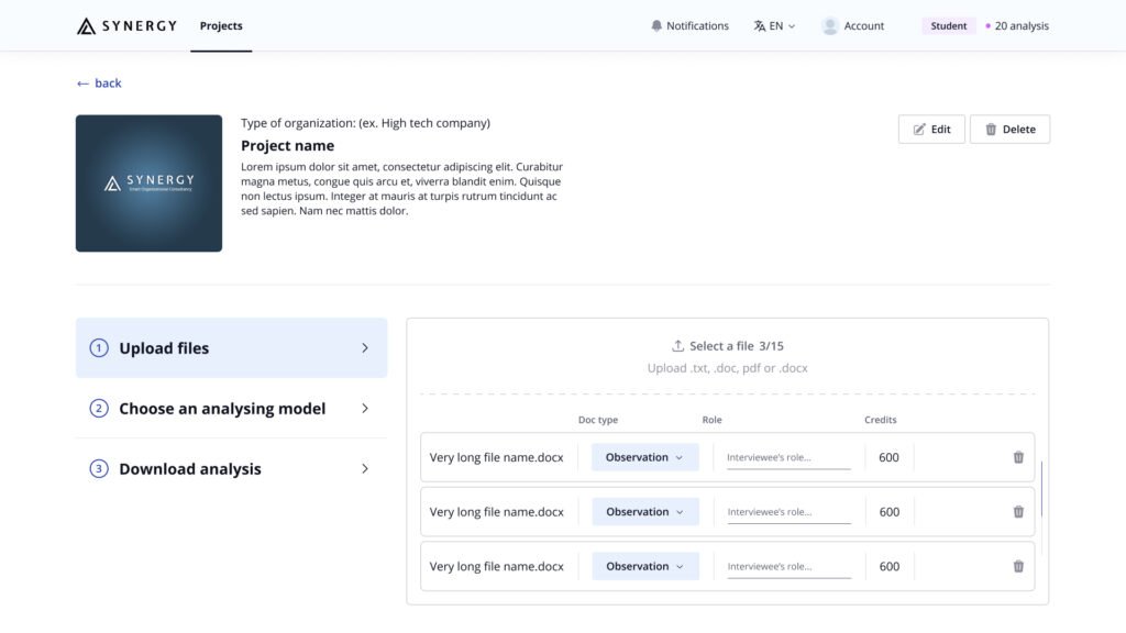
Add new project page - Before
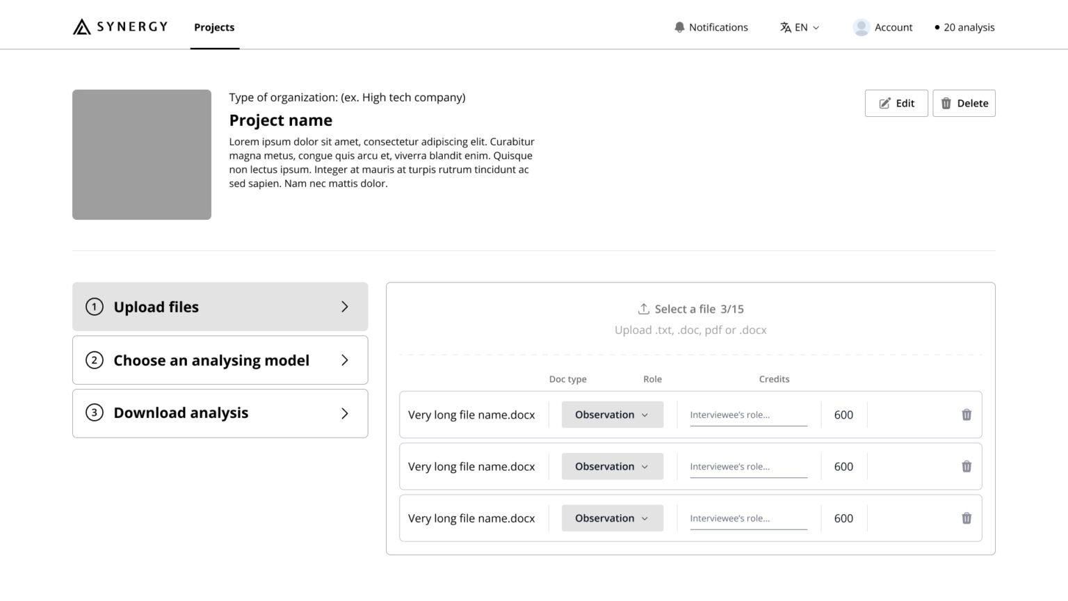
Add new project page - After
Student account page - Before
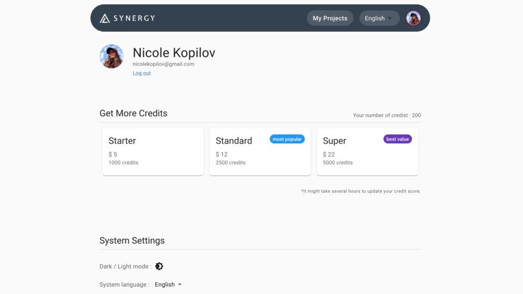
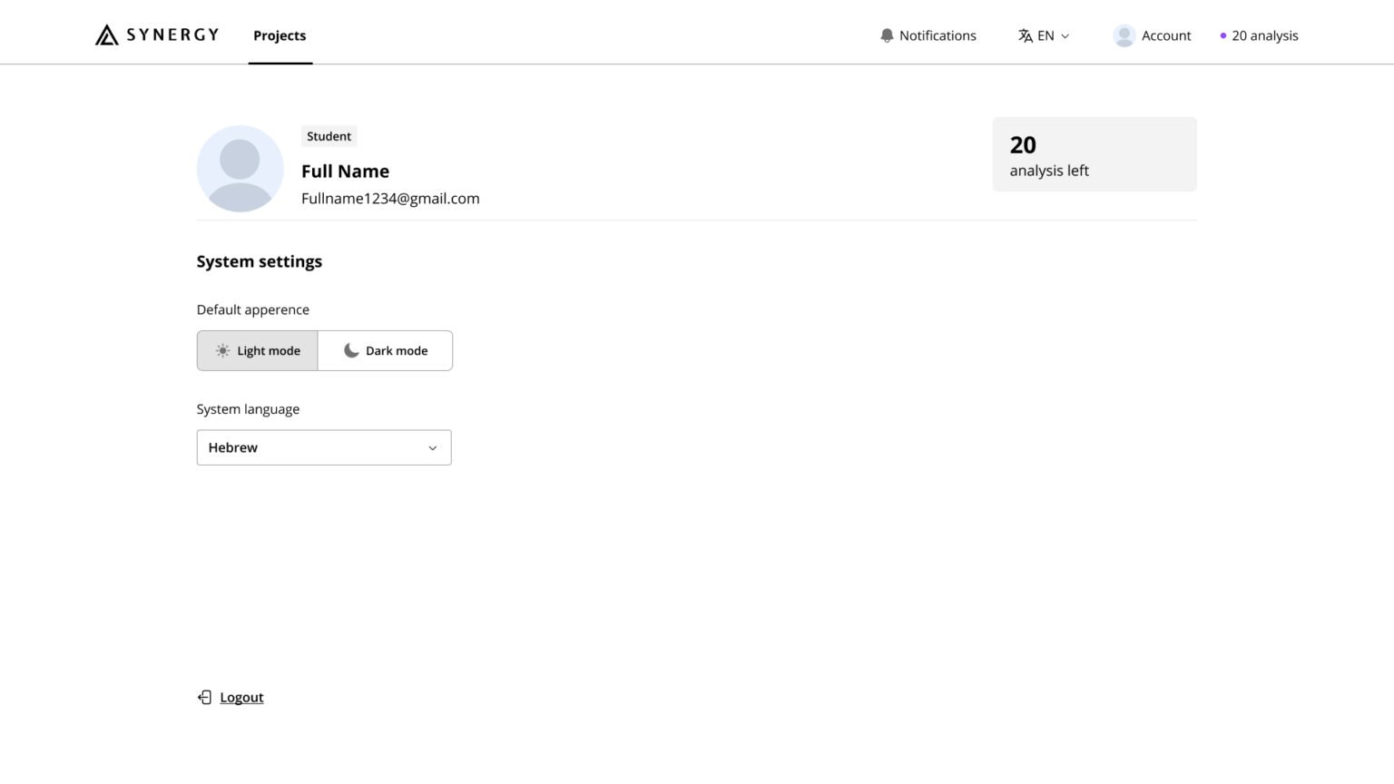
Student account page - After
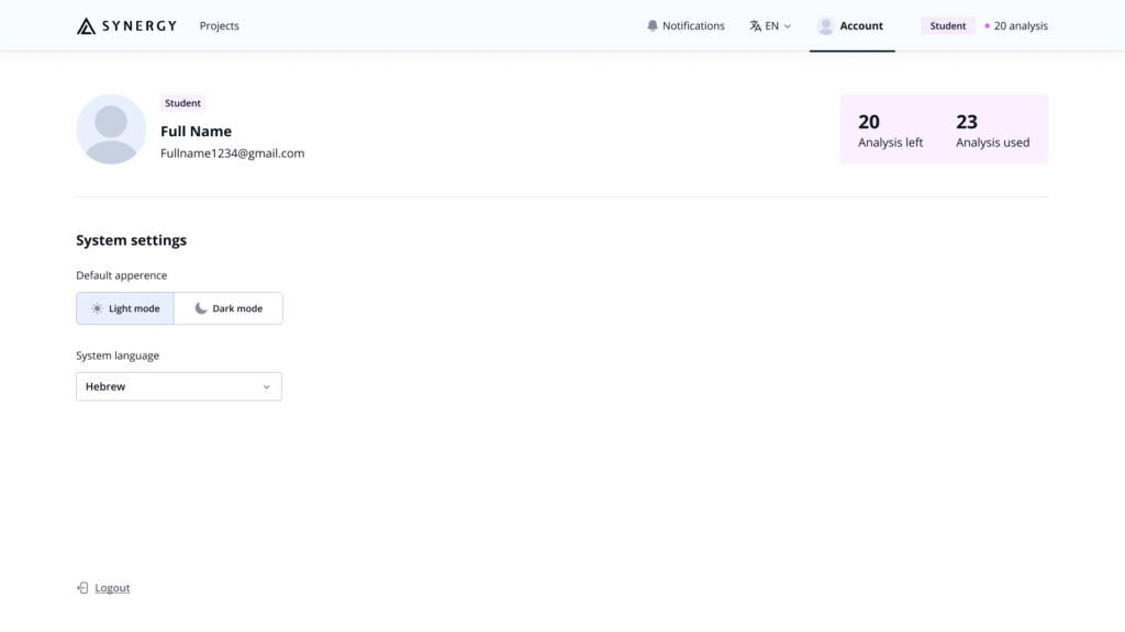
Final design
Minimalist Redesign
The design of Synergy is focused on clean aesthetics and simplicity, ensuring a seamless user experience for both students and teachers.
Key Fetures
Feedback and Indicators
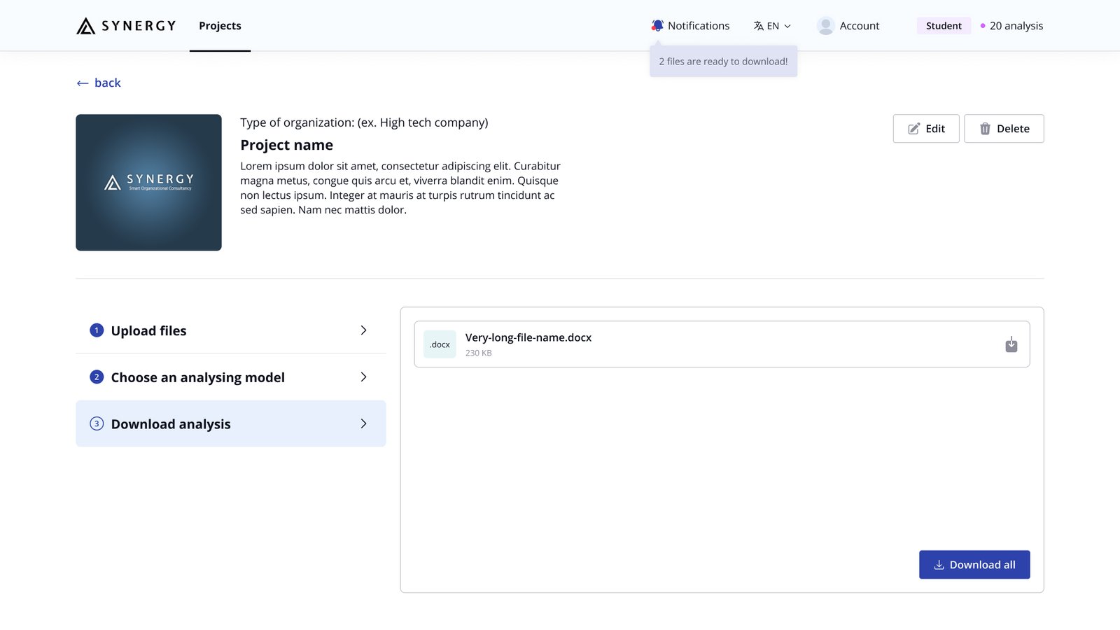
In the redesigned Synergy system, one of the most important improvements is the inclusion of clear indicators and real-time action feedback. This was a key element missing in the previous version, which left users uncertain about the status of their actions.
The new design incorporates visual cues, progress bars, and confirmation messages to keep users informed at every stage of the process.
Confirmation messages after making changes
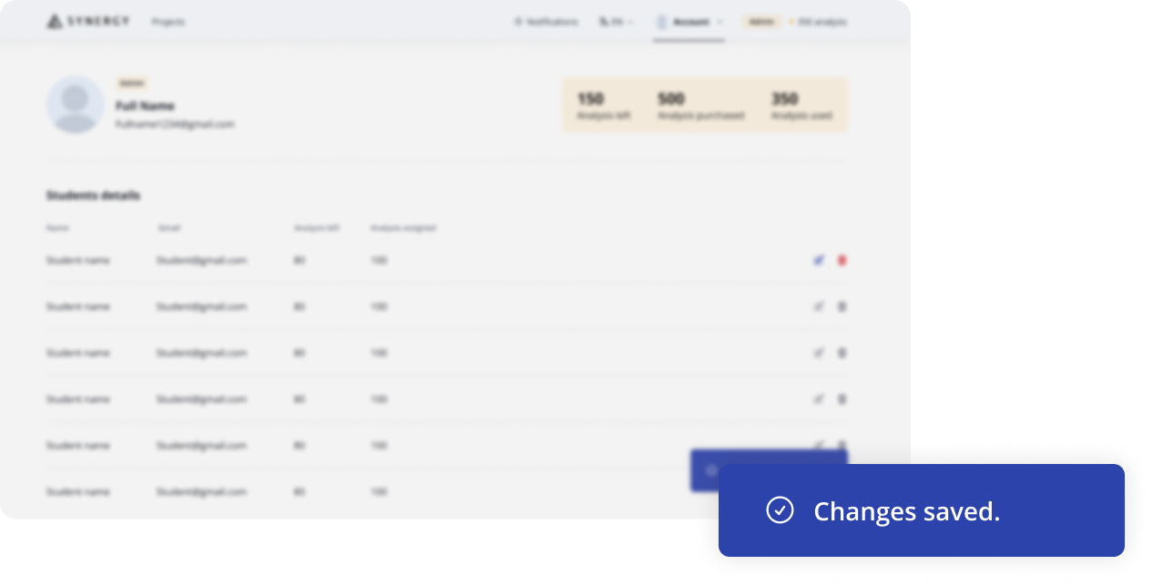
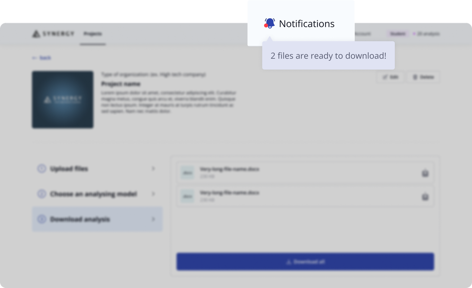
Notification when the process is done
Progress bar when uploading a file

Multi-role Interface
Clear Role Separation
in Synergy's Design
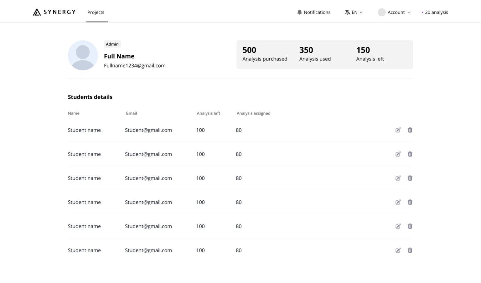
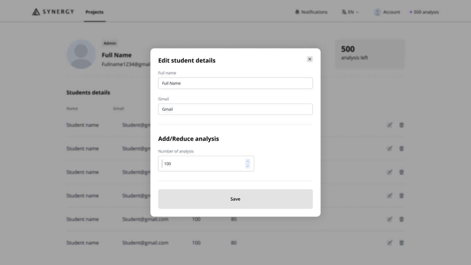
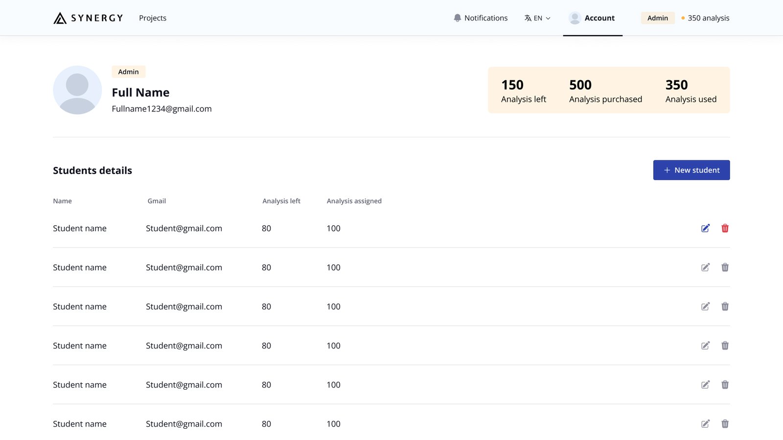
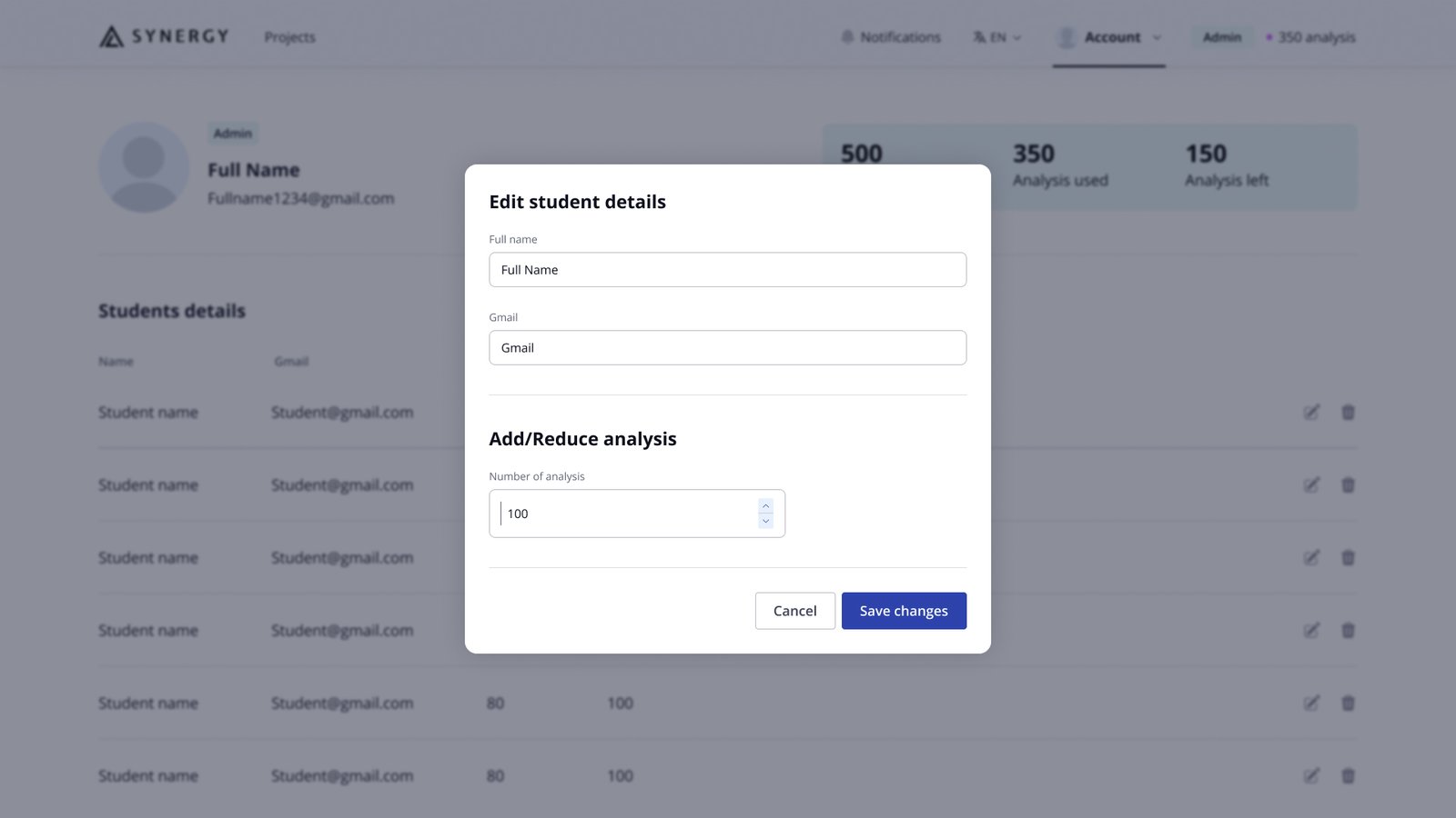
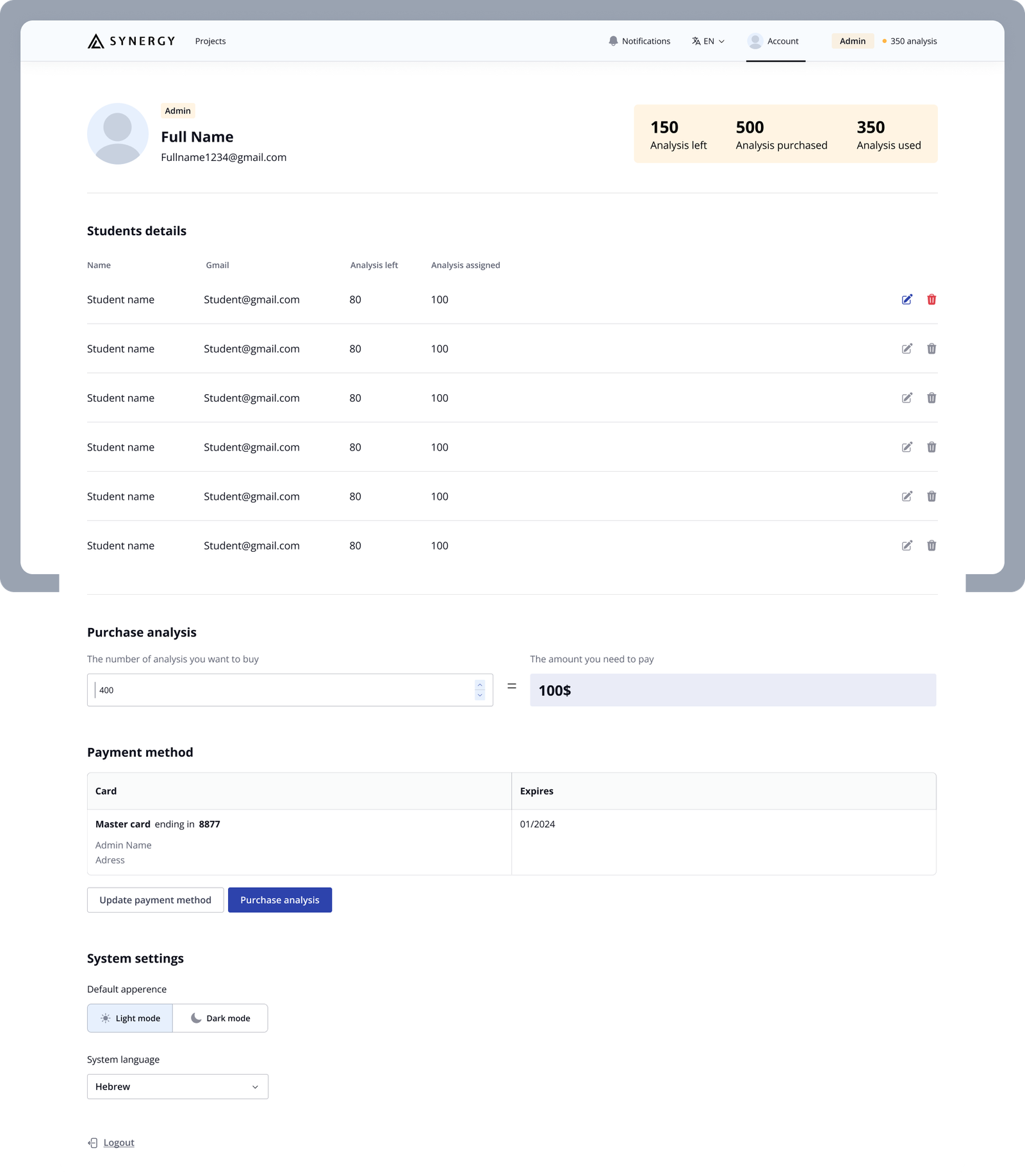
The admin side allows teachers to manage students—adding, editing, assigning credits, and purchasing additional credits—all in a streamlined and intuitive account page.
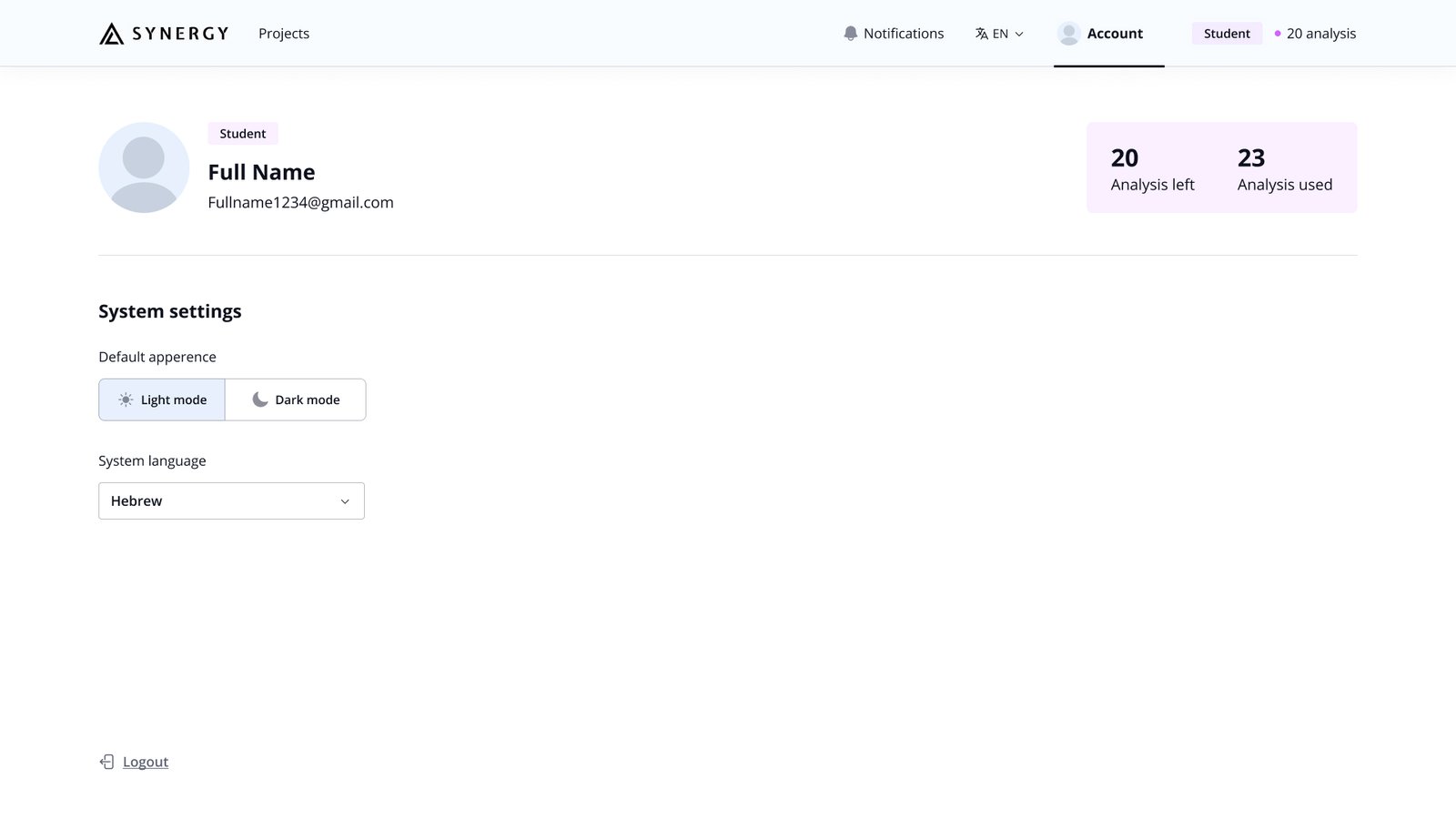
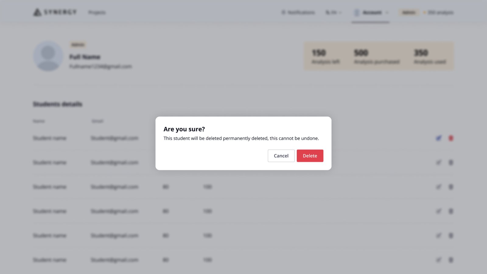
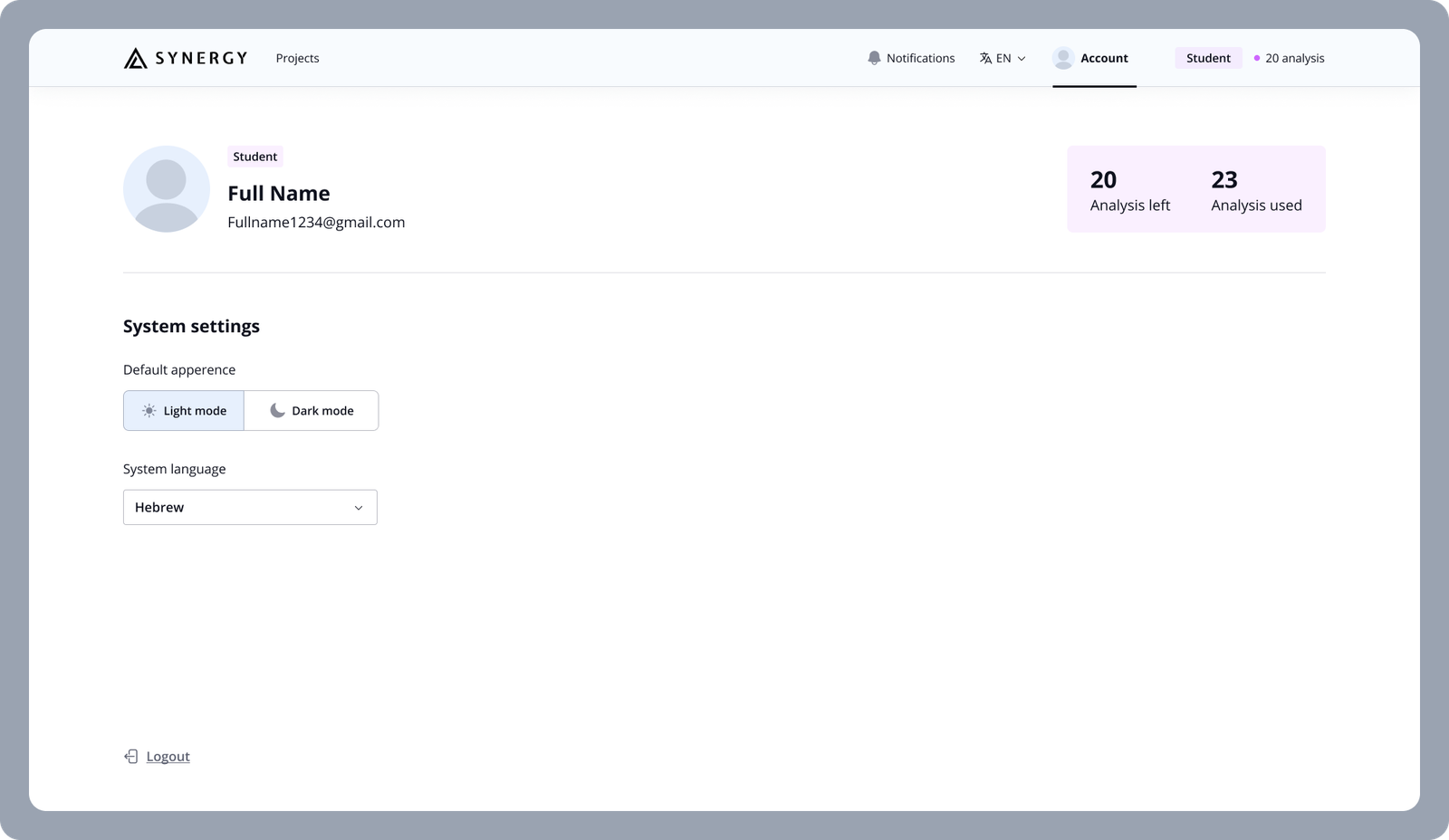
Previously, the design blurred the lines between roles, mistakenly suggesting that students could purchase credits, leading to confusion. My redesign clearly separated the student and admin functionalities, ensuring that each user role has access only to relevant features, enhancing both usability and system clarity.
Admin teacher side
Student side
UI Design
Components
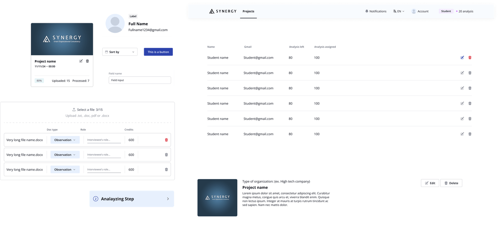
Components allowed me to implement design changes more easily and ensure that any updates would be applied universally, reducing the risk of inconsistencies.
Components also have variants for states, interactive and UX behaviours, these are all accounted for when setting the UI for components.
Thank you!
I hope you enjoy it as much as I did creating it.
