HousetableB2C Fintech2024—2025

The platform redesign

app.housetable.com/getting-started
Getting to know you, the opening task

Role

Product Designer

Duration

2024—2025

Teams

Design · Engineering · PM

Tools

Figma · Hotjar · FigJam

TL;DR

Housetable connects borrowers, lenders, and contractors through one of the most financially significant decisions a person makes. I redesigned the entire product while it was live: a complex, three-party fintech platform, rebuilt to feel simple, transparent, and human for first-time borrowers, many of them older and less digitally confident.

3

stakeholder types sharing one platform

78%

of users who started registration never completed it

1

designer, redesigning the product while live

Context

A high-stakes process that couldn't afford to be confusing.

Many borrowers are older, less digitally confident users making a major financial decision, often for the first time. The product needed to work for someone who might struggle with a QR code, not just a power user. And yet the original product was designed as if users were familiar with fintech flows, comfortable with ambiguity, and willing to push through friction.

Original registration flow · drop-off per step

−12%

Left at Photos · 76% remained

  1. 01Home value−9%
  2. 02Property−3%
  3. 03Photos−12%
  4. 04Calculator−9%
  5. 05Submitted−5%

38% of those who started never submitted.

Indicative · Hotjar & team feedback

Discovery

Finding the real problems underneath the obvious ones.

Before sketching anything, I spent time learning the system from the inside: walking every flow, mapping friction, and gathering signal from multiple sources.

Heuristic evaluation

Walked the entire flow myself, multiple times, mapping every moment of confusion, missing feedback, or broken hierarchy.

User feedback analysis

Consolidated complaints and questions from borrowers and contractors. Recurring themes: photo uploads and process clarity.

Hotjar analysis

Session recordings confirmed drop-off patterns. Highest abandonment at photo uploads and the calculator.

Competitive research

Studied how mortgage, insurance and fintech onboarding flows handle long, high-stakes processes.

Team interviews

Spoke with the PM and developers about what they heard from users, and what they struggled to explain or build.

Flow mapping

Mapped every borrower touchpoint from lender referral to project approval, including waiting states and cross-device moments.

The calculator wasn't the problem. Its placement was.

A useful tool had become a mandatory gate, forcing users through a long estimate before they could see if they qualified for a loan. That single insight, from the drop-off analysis, shaped the biggest decision of the redesign.
Process

Research first. Then iterate until it works.

The process wasn't linear. It was a loop. Each phase informed the next, and testing always sent me back to refine.

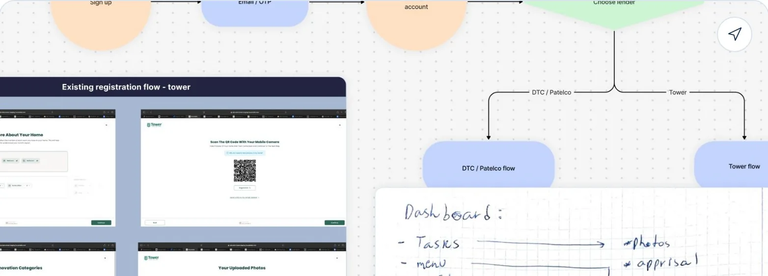
Flow maps in FigJam: every user type, step, waiting state and cross-device moment — plus dashboard sketches.

Phase 02 · Map

Every flow, every state

Mapped every possible flow: all user types, every waiting state, every cross-device moment. This revealed the real structural problems: a flow architecture that didn't match how people actually moved.

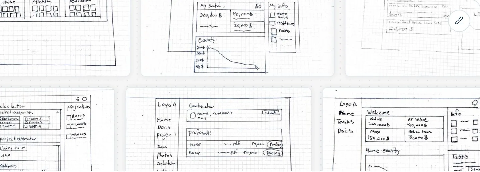
Pen-and-paper wireframe sketches exploring flow structures before Figma.

Phase 03 · Sketch

Structure before pixels

Explored flow structures before touching Figma: where the calculator lives, how the RRA is organized, how the device handoff works. Dozens of variations, pen and paper first.

Usability test findings mapped to specific UI changes.

Phase 04–05 · Test & iterate

Findings, not opinions

Wireframes in front of real users as early as possible. Every test produced a specific list of changes: "the user missed this CTA", "this label was confusing" , each traceable to a finding.

Framing

Three problems. Each one compounding the others.

01
It asked too much, too early
Basic info, photo uploads, and a full renovation calculator, bundled into one exhausting sequence.
78% drop-off
02
Then it went silent
Photos, forms, invitations, all disappeared into a void. No confirmation, no status, no continuity.
0 confirmations
03
And it never looked trustworthy
An interface that read like an internal admin tool, not a six-figure financial decision.
no design system
38%of everyone who started never submitted at all.

How might we

Make a 3-party, multi-step financial process feel manageable for someone doing it for the first time?

Give users confidence that their actions are being received and processed, without constant follow‑up?

Reduce cognitive load in registration without losing the information the system actually needs?

Decisions

The choices that changed the product.

Every major decision came from a specific insight. Each one required tradeoffs, and some required real stakeholder alignment.

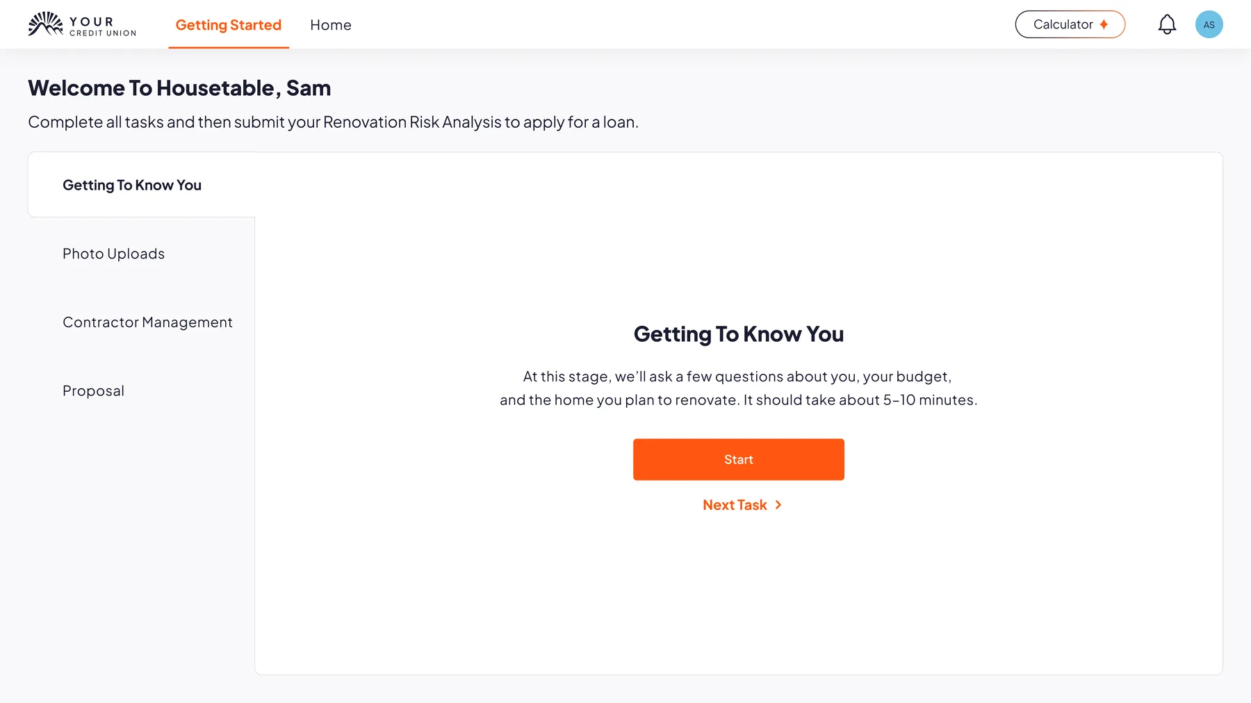
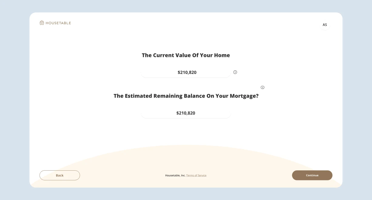
Getting Started, opening screen, with the calculator gone from the flowProperty information, most of it already filled from the lenderCompleted tasks collapsed into summary cards, progress always visibleA QR code that hands the photo task to the phone

Onboarding without the calculator

Decision 01

Remove the calculator from onboarding

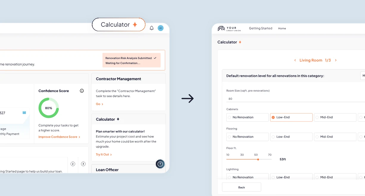
The AI renovation calculator was Housetable's flagship feature, something the team was proud of. But data showed the highest drop-off at exactly that step. Users don't want to estimate renovation costs before they understand the loan. The calculator moved to the dashboard: available when relevant, not required to proceed.

Misplaced priorityRequired alignment

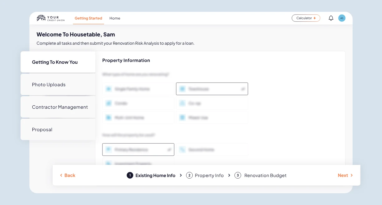
Getting Started, opening screen, with the calculator gone from the flow

Decision 02

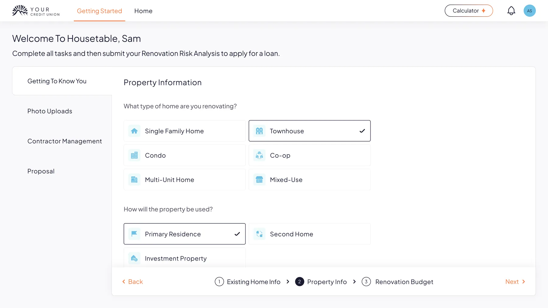
Use lender data to pre-fill onboarding

A new integration allowed Housetable to receive borrower data directly from the referring lender. The redesigned flow started with confirmation, not interrogation, dramatically reducing the perceived effort of getting started.

Redundant effortBackend integration

Property information, most of it already filled from the lender

Decision 03

Restructure the RRA as a task dashboard

Instead of a linear wizard, Getting Started became a task list: each step clearly named, independently accessible, and progressively revealed. Users could see the full picture, understand what was done, and return to any step without losing context.

Lost in the flowTask-based structure

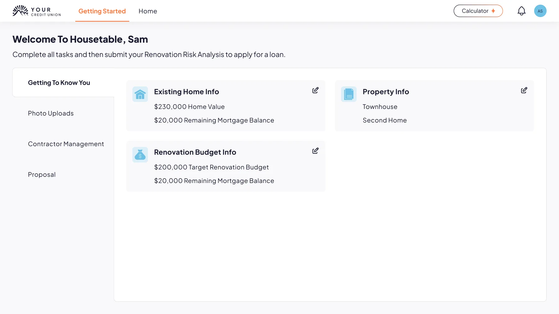
Completed tasks collapsed into summary cards, progress always visible

Decision 04

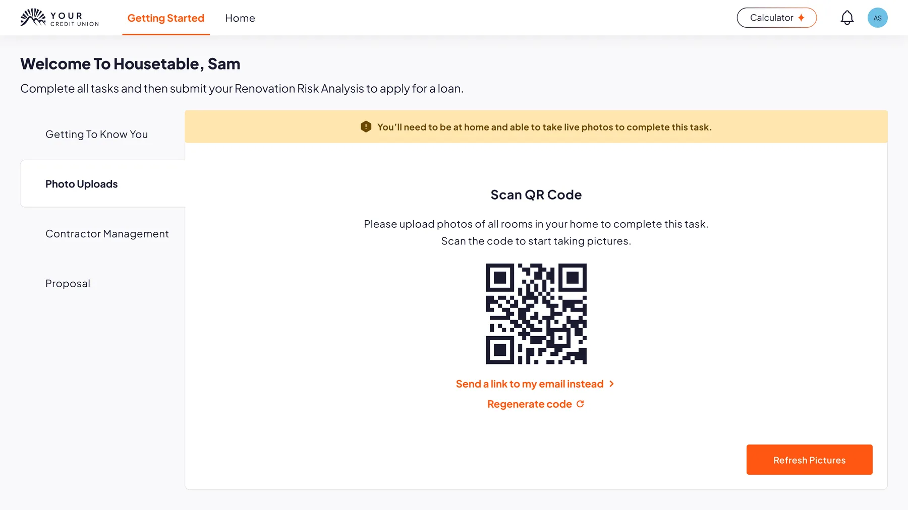
Design for the desktop → mobile handoff

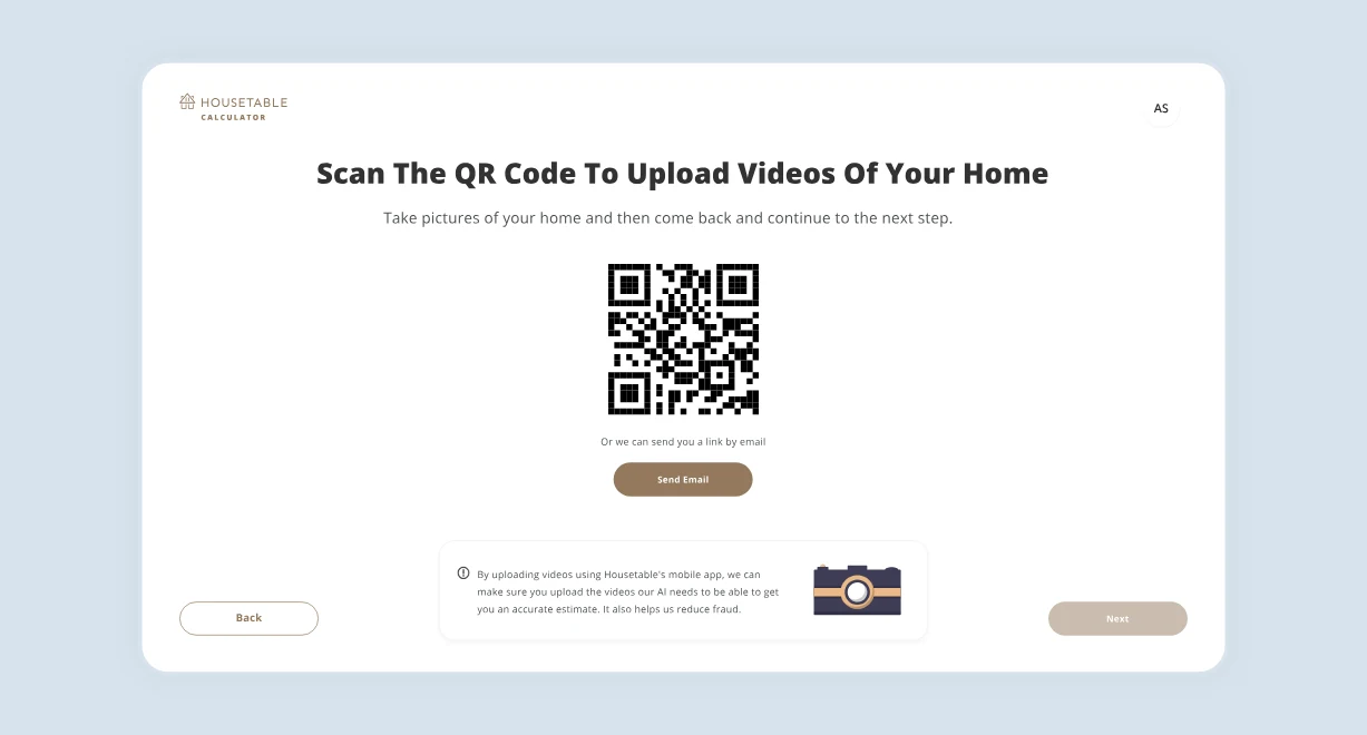
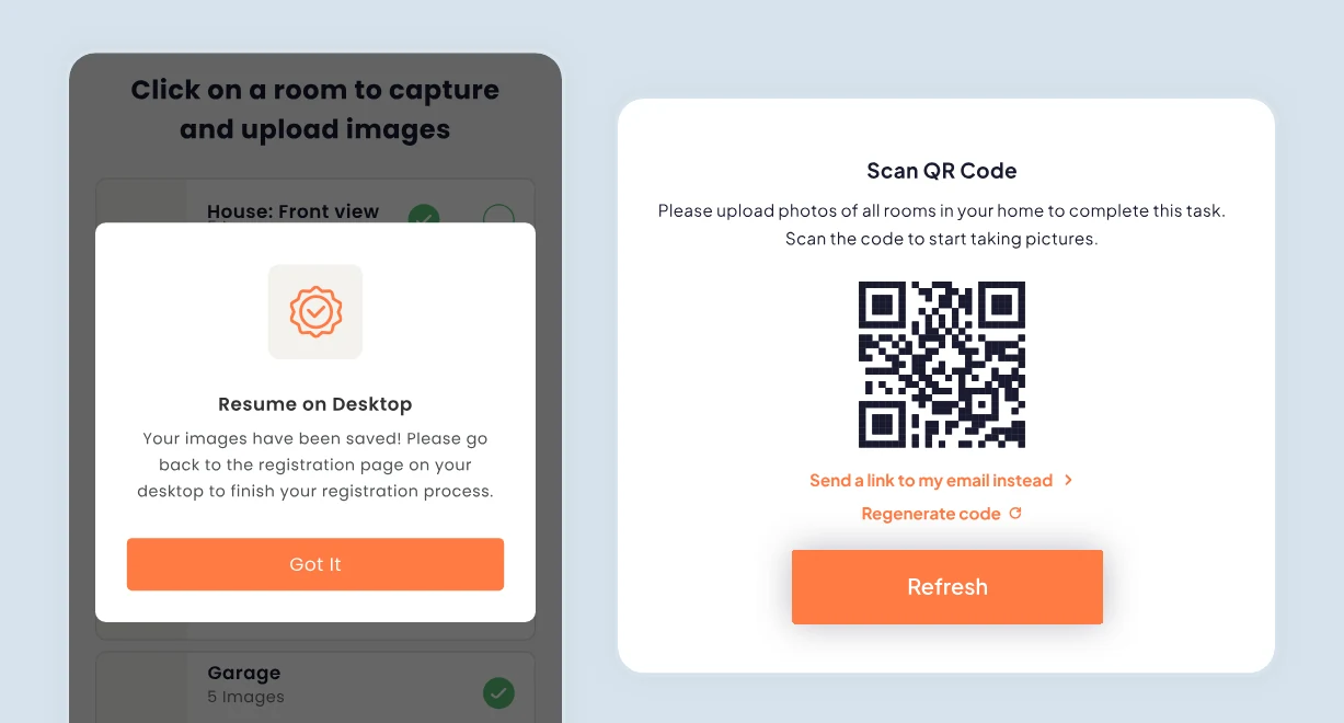
Photo uploads required switching from desktop to mobile. The original flow treated this as a simple redirect, so users got confused and dropped. The redesign made the handoff explicit: QR code on screen, email fallback, and a Refresh button that confirmed when photos arrived.

Context switchingExplicit handoff

A QR code that hands the photo task to the phone

The redesign

What changed, and why it matters.

Selected screens showing the most significant shifts. Each change addresses a specific problem from research.

01 · Registration flow

Before · Registration wizard After · Task dashboard BeforeAfter

A blind wizard, rebuilt as a task dashboard.

No progress indicator became sidebar navigation and sub-steps. Users see the full picture and know exactly where they are at all times.

02 · Photo upload and device handoff

Before · Mobile redirect After · Explicit handoff BeforeAfter

A silent redirect, made an explicit handoff.

Users switched devices and got lost. A QR code, email fallback, and refresh button now make every step of the handoff visible and confirmed.

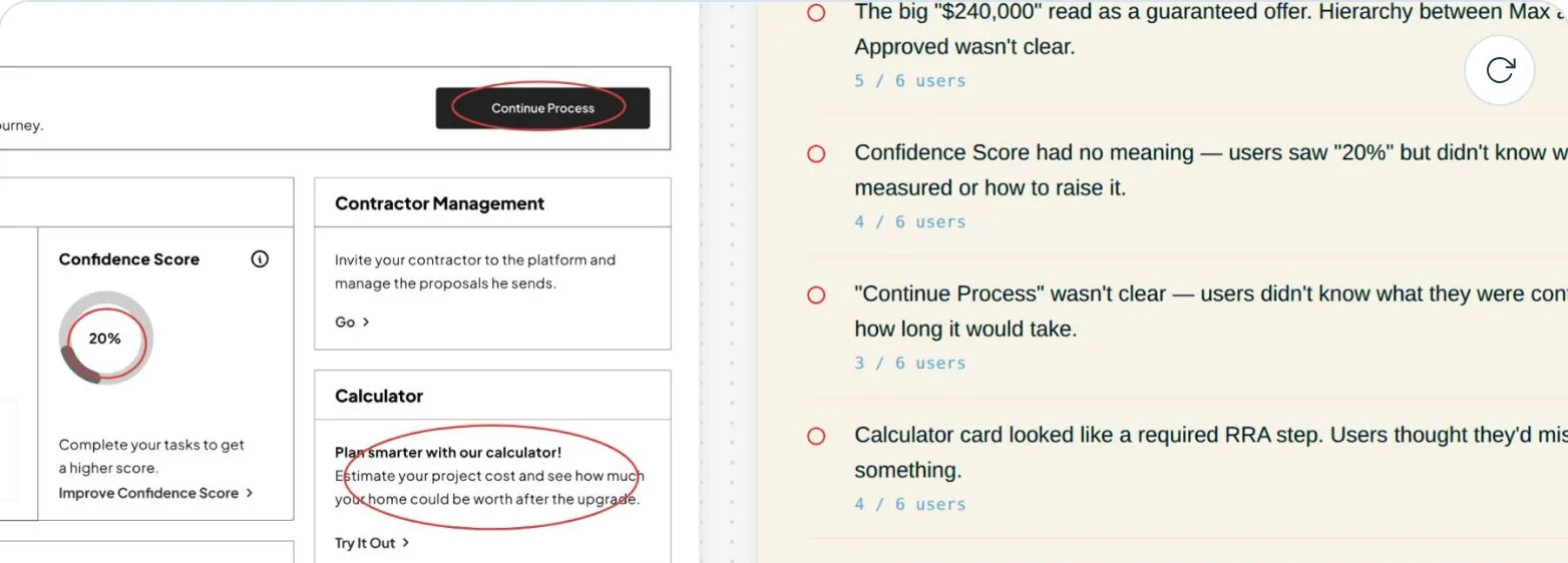
03 · The renovation calculator

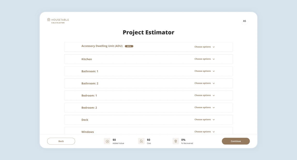
Before · Calculator inside onboarding After · Calculator as a tool BeforeAfter

A required step, moved to an on-demand tool.

It came after the photo step that had already exhausted users. Removed from the required flow and placed in the dashboard, so users reach the platform faster and calculate when they actually want to plan.

Constraints

Startup speed. No shortcuts on quality.

This wasn't a case study with unlimited time and a clean brief. It was a live product, a small team, and real pressure to ship.

01

Time pressure

Every decision had to be defensible, fast.

Time pressureHow I handled itPrioritized by impact, not completeness. Highest drop-off first.
02

Shipping while redesigning

Features shipped mid-redesign.

Shipping while redesigningHow I handled itToken architecture. Components migrated one by one, no big bang.
03

Sole designer

No team to review with, no lead to escalate to.

Sole designerHow I handled itTurned the team into design partners. Weekly options, not approvals.
04

Iterating on a moving target

Product direction kept shifting.

Iterating on a moving targetHow I handled itDesigned for flexibility. Cheap pivots, loosely coupled.

The screens

The product, as it shipped.

The task-based platform in use. Every screen here is the same system under one bank's brand, which is what the theming case is about.

01 · The task dashboard

The opening taskExpectation set in minutes, not fields. The task rail on the left means the end is visible from the first screen.
Completed work collapsesFinished tasks become summary cards with a tick, so progress is legible at a glance.
Property informationGrouped by meaning rather than by database table. Asked once.
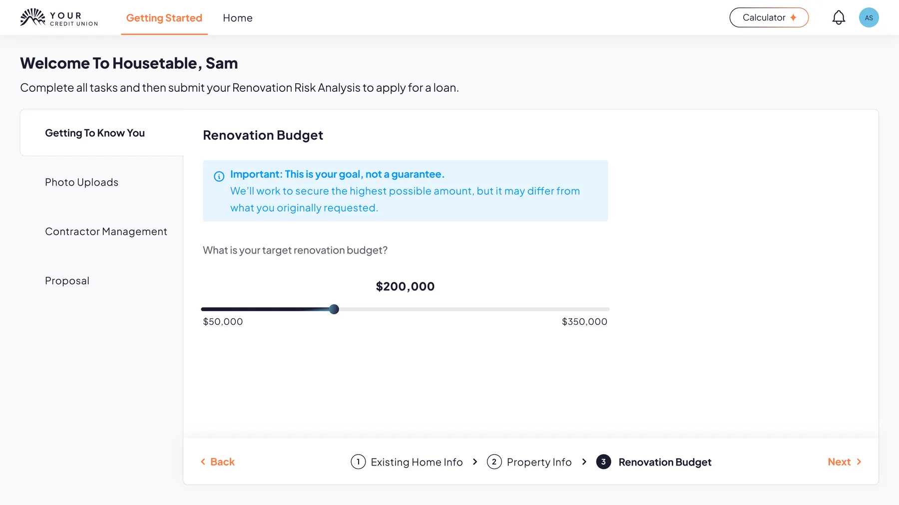
Renovation budgetA target, not a guarantee. The product says so before the borrower can misread the number.

02 · The heavy tasks

Photos move to the phoneA QR handoff instead of a desktop upload, because the camera is not on the laptop.
Confirmation, by roomUploads come back grouped, so the person can see the task is genuinely finished.
Contractor invitationThe third audience enters through the same product, not a separate one.
Proposal and draw scheduleDocuments, costs and holdback in one view, for the bank as much as the borrower.